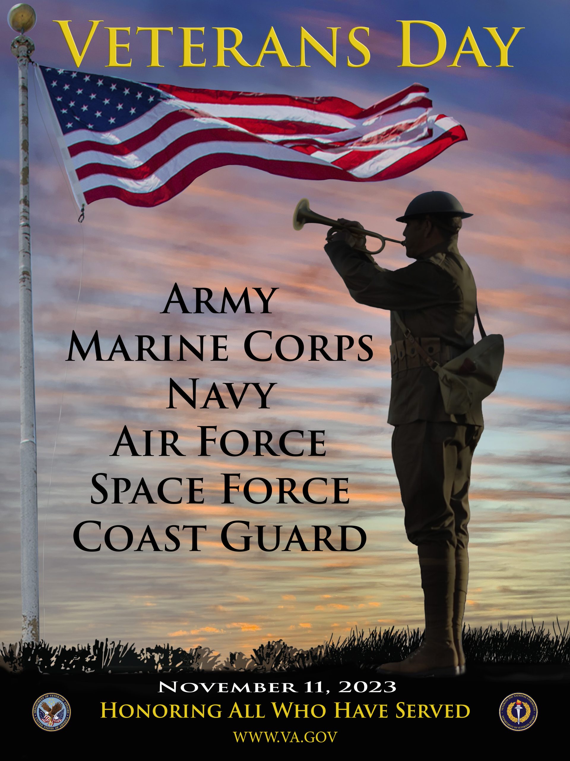
For the 2023 Veterans Day Poster Contest, the Veterans Day National Committee (VDNC) called on professional and amateur artists to create picture-perfect designs that reflect the theme of this year’s Veterans Day observance: service.
There were more than 60 entries from people ranging from school-aged children to graphic designers with decades of experience. When all ballots were tallied, the VDNC selected “The Bugler” by Gene Russell, a service-connected disabled Army Infantry Veteran and VA employee, as this year’s winning submission.

Russell is the principal photographer for the VA Secretary in Washington, D.C., and he spends his days photographing the Secretary’s significant events and documenting other senior VA leaders’ internal and external engagements. Described as “customer-service obsessed” by acting Deputy Secretary Scott Blackburn, Russell received the VA Secretary’s Honor Award for “I CARE” in 2020 for his work on the Center for Women Veterans’ “I Am Not Invisible” (IANI) campaign. The I CARE Award is VA’s highest honor for customer service and workplace excellence, and refers to VA’s five core values: Integrity, Commitment, Advocacy, Respect and Excellence.
Music was the inspiration for Russell’s submission; he has played the bugle since he was a boy. “Bugle calls are not songs, and they do not have lyrics. Yet, when heard, the calls evoke the emotion and the pride of service for members of every uniformed branch listed on this poster,” he said.
More than 100 bugle calls are used in the United States Armed Services, including a few used only in emergencies, such as “man overboard” or “abandon ship.” For that reason, the bugler connects each service member on land, air and sea.
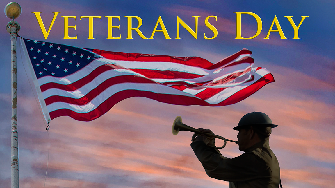
“My goal was to link the sight, sound and feeling of how we served our country. The pole and American flag in this image are the ones currently flying over VA headquarters in Washington, DC,” he said. “It flies for each of us and those Veterans to come.”
The Veterans Day poster will be displayed in VA facilities, military installations and municipal buildings across America. It will also serve as the cover of the official program for the Veterans Day commemoration at Arlington National Cemetery on November 11.
Topics in this story
More Stories
MyVetBENEFITS is a free, easy-to-use third-party mobile app and website that matches Veterans to the benefits they’re most likely eligible for.
Together We Served has launched a new free service called "Veteran Buddy Link" to assist Veterans seeking friendship and support.
Since 2010, more than 36,000 individuals have benefited from ACP's mentorship program, which equips Veterans and military spouses with the tools and resources to pursue meaningful employment.


When will the high/low resolution images be available and where will they be posted?
IT is a excellent choice. I Love It
How and where can we get some of the 2023 Veterans Day posters?
WOW It says it all and really has my pride swelling that I severed my country with that pride and with distinction! And yes the bugle does invoke that sense of pride and love of country! Thank you.
Congratulations Gene , Great Job.
Thanks for your outstanding work!
I was in Nam 1969-70. Veterans Day is not a happy day for me as I brought my best friend home 6Feb70.
Social media says there are 68 genders. Why aren’t they all represented.
It’s unfair that this bugler, representing over 15 million male veterans is shown against current DOD DEI Strategic Plan to Initiate a culture of inclusivity by enhancing relationships and review communication approaches and language utilized in print and media advertisements to ensure that a broad range of the population can relate to the advertisement. All other veterans, less than 1.75 million should be presented equitably.
I think allowing we Veterans to vote on “Our” poster is a great idea.
Good idea Jon Dixon!
This is the first I heard of this contest, so I’ll be submitting a design next year.
Generally, rules in contests like this, those working for the VA or any of its’ affiliates are excluded to avoid things like Jon Dixon mentioned.
Oorah!
Gene Russell, you Nailed it, Thank you for your service Sir!
I was looking forward to seeing the poster. Then I open it to see VA put another man on the poster. No women. Just a man. The VA don’t care about women vets. This just one more example of how women treated as second class citizens at the VA.
Shame on you, Denis McDonough.
Nailed it, girl. Old white man Denis picked old white man Gene to make a poster that excludes women.
I looked up this Gene guy on Google. What a shocker, he basically made a poster of himself. That’s so stupid. Did anyone at the VA even do a Google search??? https://www.vaforvets.va.gov/vaforvets/JobSeekers/success-stories/Pages/Success-Story-Eugene-Russell.asp
VA: changes motto to be gender neutral.
Also VA: puts only a man on a poster.
I served, too. It would be great to have some female representation or at least make it gender neutral.
You nailed it. I’m so sick of being asked where my husband is when I park in a VETERAN parking spot. This stupid poster encapsulates the sexist nature of the VA toward women vets. If the VA can’t even get a poster to represent women, why should we trust them with our healthcare??? Are they thinking about us or just soothing the egos of a bunch of old fart men who don’t respect that women also SERVE???
Congratulations to my lifelong friend and amazing person, american, and friend/brother! Well deserved and very proud of you.
What a shocking surprise VA leadership picked one of their own to win a contest. Not just anyone, the VA secretary’s personal photographer. Nothing to see here, folks.
If VA truly cared about the opinion of 19 million veterans, they would set up a voting contest so we could at least see the top 10. Instead, this was done behind closed doors so voting could miraculously get steered to highlight their own employees, and at that, someone who has already been highlighted before. That’s a great way to publicly show everyone VA plays favorites to those closest to Denis McDonough.
To the VA leadership, Veterans Day is not about rewarding your own and patting yourself on the back. It’s about 19+ million veterans who don’t whisper in Denis’ ear.
On a side note, this poster looks like a mashup of previous years, which brings absolutely no new content:
2022 poster – A giant flag waving (see https://news.va.gov/105515/winning-design-selected-in-the-2022-veterans-day-poster-contest/)
2021 poster – A fake colorful background with a single male figure (see https://news.va.gov/90941/winning-design-selected-2021-veterans-day-poster-contest/)
2020 poster – A fake colorful background with outlines of people (see https://news.va.gov/76450/winning-design-selected-2020-veterans-day-poster-contest/)
This sends a pretty clear message to all artists: Only submit a poster of giant flags or fake colorful backgrounds because that’s all our tiny mysterious voting group wants.
Also, there’s multiple other problems with this poster:
– The bugler is male. I guess representing females as well would be too much to ask for. What message does this send to the nearly 2 million female veterans who have served as well? Oh, by the way, it was a lone male on the poster last year as well. Way to exclude millions of females who served beside us.
– The bugler is wearing a World War I infantry uniform. The Navy and Coast Guard never wore those uniforms. The Air Force and Space Force didn’t exist. I guess 2/3 of the services don’t matter when selecting a winner. By the way, it was a soldier in an Army uniform last year as well.
– The original story (see https://news.va.gov/115113/2023-national-veterans-day-poster-contest-open/) said the following:
Simple designs look best scaled down to lapel pins. If you’d like to submit a modified design for the lapel pin based on the original poster design, you may do so.
How is all that text going to show up on a tiny lapel pin, or do the services just get dropped off because the selectors really didn’t think about how it would look on a lapel pin?
– Also in the original story, it says:
Successful designs are very simple, with minimal imagery and verbiage.
Yet, there’s all that verbiage. Great to say don’t put it in there, then select a winner that violates your own rules. Could that be to exclude certain posters?
If VA had any transparency, they would allow veterans to vote. A reporter should seriously follow up and ask to see the other submissions (FOIA request if they won’t play ball), then ask who does the voting, why the VA secretary’s photographer was selected, and why other submissions just got left out. Also, if I’m able to leave a name and comment on this very website, it doesn’t seem like there needs to be a rocket scientist involved to set up a voting ability so we aren’t stuck with these recycled themes from VA’s own employees in future years.
Last, I question whomever is leading this voting process. There seems to be no research into avoiding the same themes each year. Whomever led this process clearly does not have the leadership background to make sure veterans aren’t subjected to recycling themes and more importantly, choosing a process and potential winners that give a variety of different options. If some non-employee like me can take 20 minutes to look this up and see there’s some major problems, it seems like the head of the department leading this could take 20 minutes to do research since IT IS THAT PERSON’S JOB.
Thanks, VA leadership, for another half-hearted effort. I would expect nothing less.
As a professional graphic designer, some things to consider is that you never put anything so close to the edge of a poster, it needs room to breath, the flag pole is too close to the top and left side, the sun is reflecting on the left side of the flag pole and the right side of the statue causing the image to be unrealistic, the statue also appear to have a blurry bugle and and a solid cut out not getting the details like the hair on the back of the head, the November 11th text is squished down and not scaled or kerned correctly, the http://www.va.gov is in all caps is illegible, the logos are too small and also illegible, the grass appears fake, the flag pole could be touched up to be a clean white pole, the Veterans Day font has an emboss effect which is used just enough to be ineffective, lastly I would define a single focal point, the flag, the bugler, the services & Veterans Day seem to all hold a similar weight.
Will VA show what the other 59 artwork entries look like?
That’s Great of what he has done it looks awesome. I would have said the wind that drives the flag are the last breath from a falling soldier.
Congratulations to Gene Russell. Great job on the poster! This looks fantastic and I love how you incorporated more than just the visual with this image (sight, sound, & feeling). Bravo!
Gene Russel is an excellent photographer! This poster really makes one realize what a great country we live in!